Showing posts with label A2 Group 01. Show all posts

Sunday, 9 May 2010

Evaluation

1. In what ways does your media product use, develop or challenge forms and conventions of real media products?

When beginning looking at our music video, we first looked into the song and it's lyrics. We decided to see if there was a music video that had already been created and we wanted to see if there were any changes we might make if we were to make the production ourselves. We found that Frank Turner does have his own version of the video so we looked into that and we believe that the video could be viewed as boring. It is a simple video that is complied of only one shot, with people moving in and out doing different things to support the music side of the product - Due to the video being a tribute to the artist's friend who died, we believed that this may be the reason for the one shot. Although, we thought we could make something that was significantly more thought provoking and could really create a strong sense of emotion within the audience. Below is a showing of the shots that Frank Turner used in his video that we used as initial research -
It is clear that throughout the video certain aspects change, such as lighting, the number of people and the amount of things going on within the piece. We found that the video focused generally on adding people in through the build up of the story, and then as the story hits it's climax the people move out again. This is metaphorical of the death that was faced by his friend, but we had an idea that would make the video seem much more like a tribute to the persons life. The shot ideas we had are placed below -


We wanted to change the media conventions that were already used within the original Frank Turner video to create more of a story. Despite the fact that this goes against the conventions that were chosen by Frank Turner, there is also significant evidence to suggest that stories are included within a music video. An example of a video that focuses entirely on the narrative could be "When the sun goes down" by Arctic Monkeys -
Although, again we believe that this may not work entirely for our video either. Not many bands focus entirely on the idea of using only narrative and Arctic Monkeys are brave in the attempt. We believe that our video should follow the very typical codes and conventions of a music video by focusing on both shots of the artist as well as a narrative structure.

The most important factor that goes with creating a narrative with the piece is that it has some relevance to the lyrics of the song. For us, this was very easy because the lyrics tell a story alone and we simply followed the lines word for word. We have found that this is very common within existing products and we have compared these directly to ours below -

We also found that other artists who showed shots of the artist playing an instrument did not simply have one shot of them playing the instrument itself. Due to this research we have found that it would be beneficial to use this within our own piece because it gives the audience something more to look at as well as ensuring that we followed the typical codes and conventions of existing media products.
We also wanted to add the idea of home videos playing back over the video to show the audience the relationship between our characters. We believed that this could help the audience have an insight into their relationship and how to express the emotion that is held between them. To do this we looked at any conventions we could find. It was much more difficult to find an example of this because it was not frequent within any media texts that we initially looked into - This is one of the reasons we enjoy our video so much, because we believe that it has a much more unique idea behind it that allows our video to have a stronger establishing storyline. We were able to find one example of this and have compared it to our own work
Below are some further screen shots of the memories we used, these were desaturated slightly, but not the the point that Secondhand Serenade had done on their own work. We believe that the 50% desaturation helps to show exactly that it is a memory and people seem to find this a very attractive feature in our piece.

Print
When looking at our print, we looked directly into similar artists to the one that we had selected. The way that this worked was because it allowed us to see exactly what conventions were typical in our selected genre. We did not want to create something that does not fit our genre because it will directly confuse our audience and may even take away potential buyers of the CD.

Our artist is an alternative acoustic artist and this is a genre enjoyed by our group so it was easy to select exactly what we need and want to see within a CD. We looked any many examples to see which ones we believed to be aesthetically pleasing as well as ensuring that we stayed within the conventions of a typical CD packaging.

This idea above also links to the design that we used on the back of our CD packaging. We found that the front and back of CDs match perfectly in design aspects to ensure continuity throughout our piece.

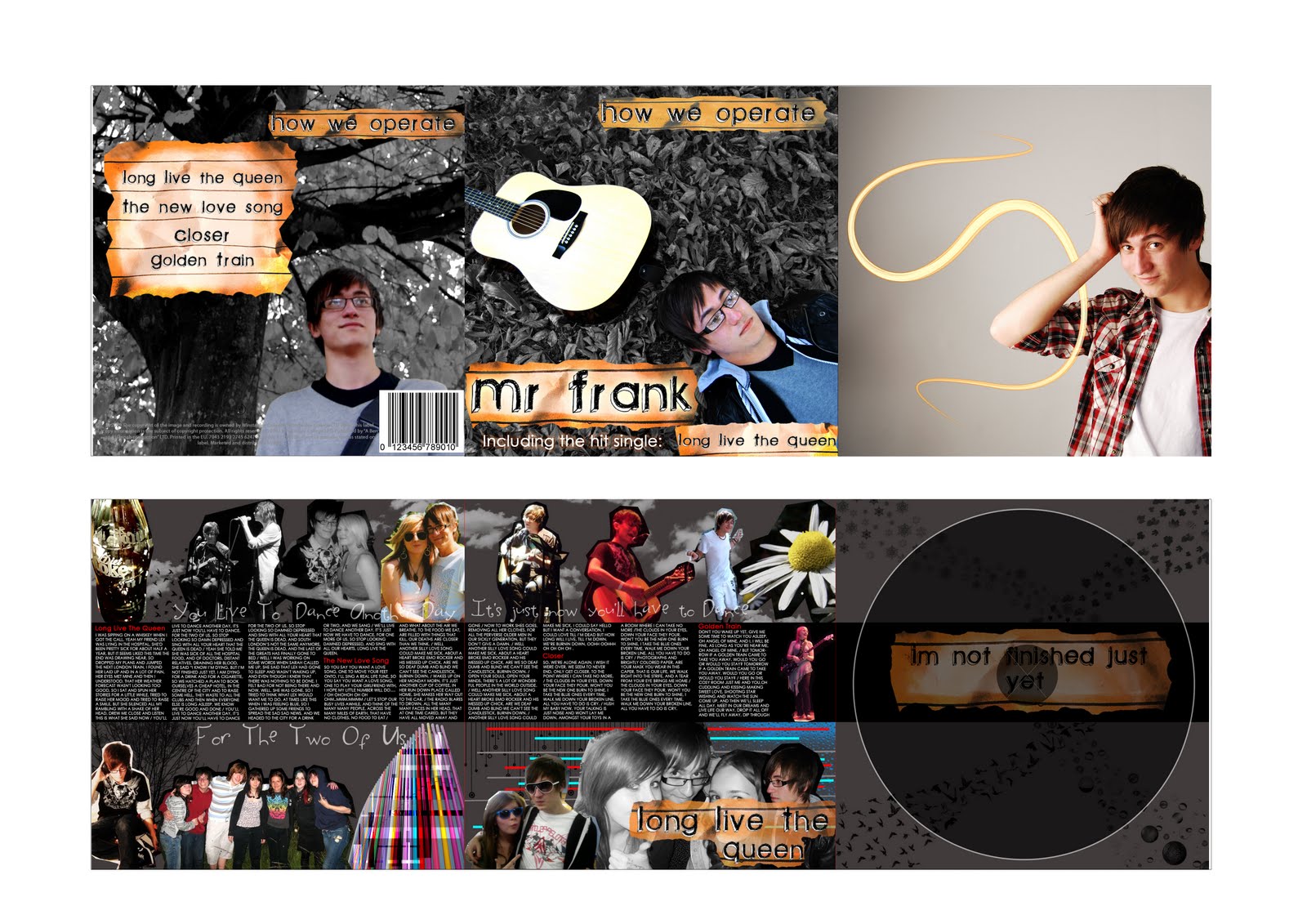
We also found that the inside of the CD packaging was also consistent with the front and back also. To do this we simply looked at more examples to see how it was that they had done this. Typical examples showed that there were lots of pictures, interesting designs and the lyrics to the songs that would appear on the CD itself. We wanted to follow this convention exactly and the end product is presented below.


We then looked into the idea of posters and magazine adverts. It was common that these were exactly the same design wise and would appear in both formats. We wanted to make the CD cover closely related to the advert that we created. To do this we used the same location and included the ideas of leaves. This was also common within many of the examples and many of the themes clearly followed one another.


Evaluation

2. How effective is the combination of your main product and ancillary texts?

When creating our ancillary texts we wanted to ensure that they fit with our main product. The main thing we needed to look into was the idea of genre conventions. The conventions of which were displayed in the first question and it is clear to see how our CD has fit in with already existing products.

The way in which we made both of them work together was to stick to some similar themes. The best of which was the use of home videos within the video which we linked to the idea of using home photos of the artist. To do this we simply lifted them from Ben's own photos with his friends. The results of which are shown below in comparison to the video -

Examples of home videos within the music video

These are examples of home photos of the artist and his friends

Another feature that we ensured was used across the forms of media was the emphasis on the main song. This was used on the cover and magazine advert very clearly and we decided to use some small examples of the lyrics larger on the page that contains all the lyrics for the CD. The lyrics we selected we "You live to dance another day, it's just now you'll have to dance for the two of us". We used this to emphasis the song and show that it has great importance to both the CD and the artist themselves.

Another similar feature that we used across the two forms of media is the idea of nature. Within the video we used shots of the artist playing outside in a field near a tree, this then links directly to the idea that we used for both the from and back of the CD packaging and this also works well across the two forms of media.

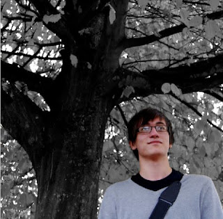
The only difference between the two is that the CD is desaturated. The reason that this was done was to simply emphasise the image of the artist and was also to fit in with the conventions that we had already looked into. We wanted to keep the advertisement colourful to help grab attention to the image and we believe this also links well to the video.

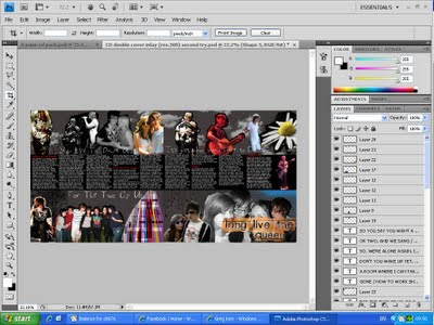
Finally, we ensured that there was continuity of fonts and designs across all the ancillary texts. To do this we saved the layers separately on a Photoshop document so they could be simply lifted from one to the other, doing this allowed us to keep perfect continuity and helped support a brand identity within the viewer's mind. The details of which are displayed below -


We also ensured that there was continuity of the burnt paper in the background because this was a significant factor in establishing exactly what the genre of our artist is. In general, we believe that the texts all work very well along side one another and really suit each other.


Evaluation

3. What have you learnt from your audience feedback?

Video Rough Cut Feedback

Jayde Markland - Jayde believed that the editing was well worked and placed together for the parts that we had already created. She particularly liked the shots and edits within in the cafe for our first chorus and believed they worked well within the piece. She also liked the handheld shots of Hannah within the hospital car park - for both the camera work and the editing used to make it appear as a home video.
Due to the fact that the video has not yet been completed, she thought that the home video shots appeared to be random and not seem to make any sense when looking at the video from a narrative point of view. She has told us that once the rest of the video has been included that it will begin to make sense and can be followed easily and effectively.


Rachel Unsworth
- "When you're singing with the guitar I think you need a close up of you singing or more camera movements in that bit like a medium shot. When Hannah is singing the lyrics, it could be much clearer what she is saying. I would have thought it could either be re-filmed or replaced with another kind of video.
I really like the home video within the car and the close up of the guitar as one of the opening shots. The editing in the scene in Ben's room also works well moving from him playing guitar, to the phone, and back again."

Catherine Schofield - "If I was completing this task for my coursework, there are a few things that I may consider changing, however there are also a large amount of techniques and styles used that look particularly effective.
The things I would change starts with the idea of a tighter shot of Ben on guitar, as I feel there is too much wasted white space around him. Also, in particular when the notes played on the guitar are highlighted within the song, I would consider doing a close up of bens hands on the guitar. Another change I would consider would be that Hannah wouldn’t look into the camera, and that Ben and Hannah should be face to face closer, rather than whispering in his ear. Therefore, the shot of Hannah speaking would be a very tight close up from over Ben’s shoulder. As well, I would consider playing with the line “now you’ll have to dance for the two of us” by maybe doing a shot of Ben and Hannah messing around dancing, possibly on a dance mat, helping to emphasize how close and comfortable they are with one another. A final change I would consider is a different shot for the line “trying to think what Lex would want me to do” I would maybe repeat the earlier shot of Ben and Hannah messing around playing funny faces, with Ben looking sad across at Hannah in a ghost form, to imply that he still sees her around in places they have been together before.
There are many effective shots and props used within this clip. Hannah’s dressing gown with contrasting colours of pink and black are very effective as the black obviously hints at the bleakness of the situation, whereas the pink highlights Hannah’s characters bright outlook on life, and trying to cheer her friends up even though she isn’t well. As well, the shot of the plate being pushed across the table from the low angle makes this shot particularly effective as it is almost like Hannah is offering the audience the chance to see the horrible hospital food. The combination of “home video” style shots is impressive as it highlights just how close Ben and Hannah’s characters were. The ending is very nicely done also, as it shows highlights Hannah’s happiness and shows just how much of a nice person she is to be around.
In conclusion, there are many features that are used creatively in this clip; however if I was to complete this task, I would consider doing some shots in a different style or format."

Response to feedback

Some people commented that the chorus was a bit boring and needed something more to it, therefore we created somemore "home video" style clips to put in the chorus. Below are the clips before and after we made the changes to the chorus.


Before the home videos were added -


After the home videos were added -


When showing our video to people we got similar feedback about one part of it. This was "You have a male voice but a female singing in the chorus". We still want to leave the chorus as it is because it has not been entirely understood why we have used a female.
When looking at this we would like to refer back to our first blog post and the lyrics of our song. The lyrics going into the chorus read -

"Drew me close to listen this is what she said now,

(chorus)

You'll live to dance another day,

it's just now you'll have to dance... etc"

The reason we have decided to have Hannah singing the song instead of Ben is due to the fact that the lyrics read "this is what SHE said now", we wanted it to appear exactly as it would have happened in real life rather than simply Ben singing it because it would have been out of place within the ideas of the lyrics.


Digipak and Poster Feedback


Hannah Williamson
- "I like desaturation of the leaves against the colour of the person and the guitar, it looks professional and it is aesthetically pleasing. I also like the collage around the lyrics page, this reflects what the music is going to be like. The picture in the far right top square looks out of place but right for a CD insert because it looks like a professional taken photograph of the artist, and all the light trail just adds to the effect. In general, I wouldn't change anything about the print, it looks fine as it is"


Laura Wilderspin - "I really like the way the double panel images look - They really have an effect of scrapbook imagery and it gives the impression that the song may have something to do with memories. The tool used has had a good effect - it makes it look like it has been cut out with a pair of scissors. The use of a bar code makes the CD packaging look real and professional. The lined paper effect also goes along with the idea of a scrapbook because it looks like the writing has been torn out of a scrapbook"


Response to Feedback
In general, we have found very positive feed back from others. Due to the small amount of negative evaluation we believe that it would be within our best interest to leave the CD as it is. By doing this we will need to ensure that our magazine advert follows a similar style to the print to allow it to be recognizable. We think that we could use another photograph from Cranwell avenue because it matches the front and back of the CD packaging' therefore making the CD easily linked to the advert. This will then allow for an increase in the sales of the CD - therefore aiding the artists career and record label. We are going to experiment further we the idea of desaturation in our magazine advert. due to magazines being colourful and eye catching, we may use strong colours to grab the reader's attention to the advert.


Facebook Feedback -
We decided that we could utilise new media formats to gain feedback from other people. The best way we found to do this was through the use of the social networking website Facebook.com. This helped us because people were able to tell us what they liked and what they didn't. From this research we were able to make changes such as adding in home videos in the chorus to make it more interesting and adding more flash backs.

Evaluation


4. How did you use new media technologies in the construction and research, planning and evaluation stages?


Research and Planning


We used the internet to do most of the research for our video. This included researching videos on youtube.com and using search engines like google.com to find images of digipaks and posters that were the same genre as our song. This helped us to research the conventions used in the genre, that we would need to include. We also looked into myspace.com and facebook.com in order to find more images of the artist and asking permission from the artist.

Within this project we decided to split up and do each of the tasks seperately. Hannah was in charge of video and editing. And Ben was in charge of print. Of course, both of us past comments to the other of how to improve the work and what we believed would work well. The reason we decided to split up was that Hannah had knowledge of Adobe Premier Pro that Ben did not and Ben had knowledge on Photoshop that Hannah did not, so we decided to use our skills to the full potential and ensure that our work was to the highest possible standard.
This is a picture of Hannah working on the video on Adobe Premier Pro. She is happy and confident with the program and anything that is not understood she will ask for assistance or research possible edits online.
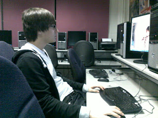
This a photo of Ben working on the print on Photoshop. If he was unable to understand any techniques he wanted to use, he gained assistance from the internet. In particular www.hongkiat.com for effective photoshop imagery and techniques.

Construction


We used Adobe Premier Pro to edit the video. This was the best program to use because it allowed us to make very specific changes to our video to ensure that we cut every shot exactly where we wanted it and also we were able to perfectly align our video so that the lip syncing was 100% spot on. For example -


We used Adobe Photoshop to create the Digipak and the Poster. Photoshop allowed us to make very specific changes to our images and allowed us to make the exact alterations we were looking for. Using this program significantly helped us in producing a piece that perfectly fits the typical codes and conventions of already existing media products.


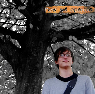
"When creating our CD packaging. We wanted to have one professional looking photograph to allow the audience to understand that the artist has a serious side too, compared to using the snap shots on the double page. The best way to do this is through the use of Adobe Photoshop to create a smooth and professional looking image.

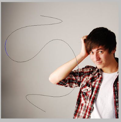
When cropping the photo down, we decided that the image was not balanced compositionally so it needed another aspect to it. Cropping the image was a simple process within Photoshop. We decided that a light trail could create interesting imagery while balancing the photo, as well as showing that the artist is young and "trendy".
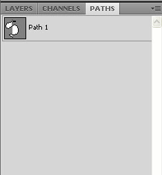
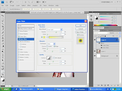
To begin the light trail we had to draw out a path on Photoshop using the pen tool. This path must be saved and placed upon a new layer for editing. Putting it on a new layer allows us to edit the path under and around Ben's body. The path must then be set to the correct brush to allow it to appear as a light trail. This involved using a spotted brush with 1% spacing between it.

We then added an outer and inner glow to the brush set trail. This allows us to select the colours we wish for our light trail to be. Due to the main colours used within the rest of our piece, we have decided to use yellow colours in our CD packaging.


This is the final created image -"


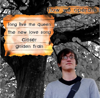
"Compositional elements are much more important within this kind of image because there needs to be space for text and other information. With these factors in mind, we came up with this image -
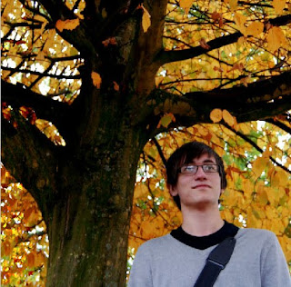
In the case of the front cover, we have to continue using the desaturated, and colour pop, effect. This image then appears as this -
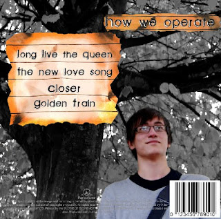
We then added the text to the image by using the same font used on the cover. We duplicated the layer that reads "How we operate" from the cover of the CD, as well as taking the small piece of burnt out lined paper to use as its background and frame. We then decided to use the lined paper effect to display the names of the songs on too. We then looked at examples of existing CDs to determine what information was left at the bottom of the panel. We found that there was information about the companies involved in the manufacturing and distribution of the CD and the use of a bar code. We then decided to add these features to our own work.
This is the final created product."


Evaluation

Throughout researching, planning and constructing our video, digipak and poster we used a blog site to evaluate how and why we were doing each thing and keep note of how it was all developing. This helped us because both of us in the group were able to easily refer back to the information and research we had collected and this allowed us to simply ensure that our work fit the typical codes and conventions of existing media products.


List of equipment
We used Dell computers to do all of our editing because these were the available computers in our college. They worked well and proved to have a fast processing speed. Although, there was issues with the memory space on each computer so we were required to use an external hard drive to hold all our work.
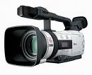
These are the cameras we used to do all of our filming during the time we conducted our project. They worked incredibly well and gave us high quality footage.