4. How did you use new media technologies in the construction and research, planning and evaluation stages?
Research and Planning
We used the internet to do most of the research for our video. This included researching videos on youtube.com and using search engines like google.com to find images of digipaks and posters that were the same genre as our song. This helped us to research the conventions used in the genre, that we would need to include. We also looked into myspace.com and facebook.com in order to find more images of the artist and asking permission from the artist.


Within this project we decided to split up and do each of the tasks seperately. Hannah was in charge of video and editing. And Ben was in charge of print. Of course, both of us past comments to the other of how to improve the work and what we believed would work well. The reason we decided to split up was that Hannah had knowledge of Adobe Premier Pro that Ben did not and Ben had knowledge on Photoshop that Hannah did not, so we decided to use our skills to the full potential and ensure that our work was to the highest possible standard.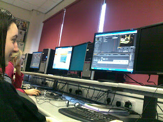
This is a picture of Hannah working on the video on Adobe Premier Pro. She is happy and confident with the program and anything that is not understood she will ask for assistance or research possible edits online.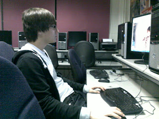
This a photo of Ben working on the print on Photoshop. If he was unable to understand any techniques he wanted to use, he gained assistance from the internet. In particular www.hongkiat.com for effective photoshop imagery and techniques.

This is a picture of Hannah working on the video on Adobe Premier Pro. She is happy and confident with the program and anything that is not understood she will ask for assistance or research possible edits online.

This a photo of Ben working on the print on Photoshop. If he was unable to understand any techniques he wanted to use, he gained assistance from the internet. In particular www.hongkiat.com for effective photoshop imagery and techniques.
Construction
We used Adobe Premier Pro to edit the video. This was the best program to use because it allowed us to make very specific changes to our video to ensure that we cut every shot exactly where we wanted it and also we were able to perfectly align our video so that the lip syncing was 100% spot on. For example -
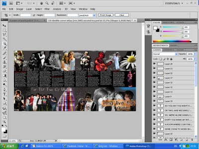
We used Adobe Photoshop to create the Digipak and the Poster. Photoshop allowed us to make very specific changes to our images and allowed us to make the exact alterations we were looking for. Using this program significantly helped us in producing a piece that perfectly fits the typical codes and conventions of already existing media products.
"When creating our CD packaging. We wanted to have one professional looking photograph to allow the audience to understand that the artist has a serious side too, compared to using the snap shots on the double page. The best way to do this is through the use of Adobe Photoshop to create a smooth and professional looking image.

When cropping the photo down, we decided that the image was not balanced compositionally so it needed another aspect to it. Cropping the image was a simple process within Photoshop. We decided that a light trail could create interesting imagery while balancing the photo, as well as showing that the artist is young and "trendy".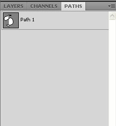
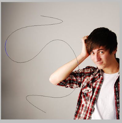
To begin the light trail we had to draw out a path on Photoshop using the pen tool. This path must be saved and placed upon a new layer for editing. Putting it on a new layer allows us to edit the path under and around Ben's body. The path must then be set to the correct brush to allow it to appear as a light trail. This involved using a spotted brush with 1% spacing between it.

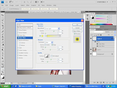 We then added an outer and inner glow to the brush set trail. This allows us to select the colours we wish for our light trail to be. Due to the main colours used within the rest of our piece, we have decided to use yellow colours in our CD packaging.
This is the final created image -"
.jpg)
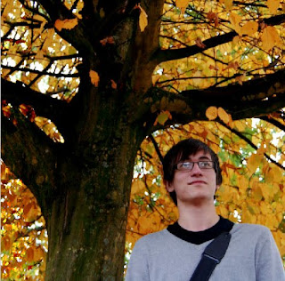
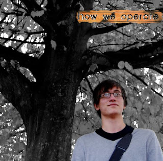
"Compositional elements are much more important within this kind of image because there needs to be space for text and other information. With these factors in mind, we came up with this image -
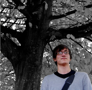
 In the case of the front cover, we have to continue using the desaturated, and colour pop, effect. This image then appears as this -
  We then added the text to the image by using the same font used on the cover. We duplicated the layer that reads "How we operate" from the cover of the CD, as well as taking the small piece of burnt out lined paper to use as its background and frame. We then decided to use the lined paper effect to display the names of the songs on too.
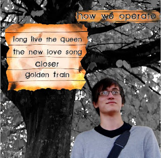 We then looked at examples of existing CDs to determine what information was left at the bottom of the panel. We found that there was information about the companies involved in the manufacturing and distribution of the CD and the use of a bar code. We then decided to add these features to our own work.
This is the final created product."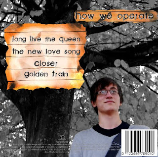

Evaluation
Throughout researching, planning and constructing our video, digipak and poster we used a blog site to evaluate how and why we were doing each thing and keep note of how it was all developing. This helped us because both of us in the group were able to easily refer back to the information and research we had collected and this allowed us to simply ensure that our work fit the typical codes and conventions of existing media products.

We used Dell computers to do all of our editing because these were the available computers in our college. They worked well and proved to have a fast processing speed. Although, there was issues with the memory space on each computer so we were required to use an external hard drive to hold all our work.
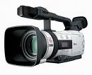 These are the cameras we used to do all of our filming during the time we conducted our project. They worked incredibly well and gave us high quality footage.


 These are the cameras we used to do all of our filming during the time we conducted our project. They worked incredibly well and gave us high quality footage.