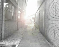
These our 6 key frames within our own work which we found compared well to the forms and conventions of real media products.
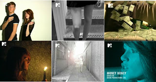
1] This shot shows our main artist engaging with a member of the opposite sex. Like in existing music videos we used the actor within some scenes, however we did not want the audience to focus on him as much as the artist and so we made sure not to have the camera focus on him for too long.
2] Like we had seen in other music videos we used the camera to pan over the artist's body to give the artist some sort of 'sexy' and 'glamerous' look, also showing the costume off that we decided to have our artist wear.
3] Because the title of the song is 'Money Honey' and the lyrics are majorly to do with expensive lifestyles and materialistic things we used props that would represent this and after being influenced by other videos, used money (which we had made ourselves to look like American dollars) draped over our set - giving the shot and location we filmed in more of an expensive feel to it.
4] The lyrics here are "Never burn out this candle baby", and so we decided to use a shot that would accompany the lyrics. We felt that this showed we had linked the narrative to the song. This shot also shows the dark, low lit lighting we used in order to create more of a dramatic and interesting atmosphere.
5] This shot shows clearly the mise en scene we used within some scenes of our video production. It also shows a full shot of the artist with her clothing and the background, which was different from the rest of the video because it was shot outside; giving the music video a greater dynamic feel. We filmed during a period of bad weather and so could not get to the destination that we originally planned, which was more of an expensive and fitting location. However we felt that having the artist walk along such alleyway would contrast her glamour.
6] Here we used a close-up of the artist singing the words of the song. This a convention used a lot among other music video producers and we felt that it was necessary as well as effective to include this within our own work. We felt that the shot enabled the audience to feel closer to the artist and also more engaged.
The colour scheme
To make our music video, digipak and poster match, we kept a colourscheme of bright, eye-catching colours throughout.
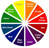
Our music video contains many bright, interesting colours which could be associated to disco-lights, especially the shots of silhouettes on coloured backgrounds.

We used many bright colours throughout. Our favourites were the pink and blue colours as we believe they were more eye-catching…
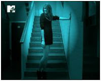
We used these colours in both our ancillary texts to keep a constant, recognisable colour scheme throughout which would make it easy for the audience to associate them together.

Other music videos and ancillary texts are known to match up too. For example, Beyonce’s latest album…

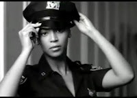
As we can see, this has a black and white colour scheme. Beyonce’s music video for her debut single from this album is also filmed in black and white to match…
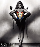
A poster which advertised this album was also in black and white, with a hint of other colours which adds impact.
The advertisement

Overall -
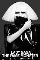
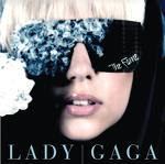
An existing advertisement for a CD is above, alongside our advertisement. It is advertising Lady Gaga’s album. It has a black and white colour scheme like that of Beyonce’s above, which gives it a simplistic effect. It inspired our advert with its stylish close-up image of the star as it really draws our attention and makes the audience feel closer to Lady Gaga herself.
Logos -
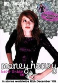
This poster/advertisement was created to be printed on large paper. We aimed for ours to be shown in magazines at about A4 size. As we can see, there are small logos at the bottem of Lady Gaga’s poster, which would be reasonable sized when printed. We have made ours larger to make them easy to see. We believe they look professional. One logo advertises our production company, one shows the MTV logo where we would like our video to be shown!
Title font –
The words “Money Honey” and “Love Grace” look handwritten. This is the style we wanted as it would look as though Grace herself has written them, making the audience feel closer to the star.
Image –
Our advert shows a close-up of our star, looking attractive and appealing. In the background we can see money. It was stuck to the wall, but the way in which it is arranged it looks as though it is floating upwards. This creates the impression that it’s floating out of our star, suiting the theme of the song. By editing the photograph we made the money look black and white so it didn’t steal the focus from the star but could still be seen. We then changed the hue of the dress to make it pink. It then matched the overall colour-scheme of our products.
Looking at other advertisements, we feel that the main priority is to attract and interest the audience, which we believe ours does.
Looking at other advertisements, we feel that the main priority is to attract and interest the audience, which we believe ours does.
The digipak
After the main purpose of holding the CD itself, we believe that the purpose of a digipak or CD case is to set the scene for the music itself i.e. it gives the audience a feel for the songs before they’ve even heard them.
The following images show existing album covers and digipaks.
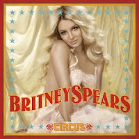
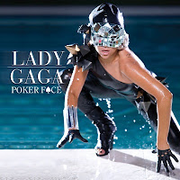
Our final digipak looks like this…
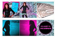
Title font – “Money Honey” matches the poster. “Grace” looks fancy and interesting, matching the theme of our music video. They are both eye-catching and fascinating.
The following images show existing album covers and digipaks.


Our final digipak looks like this…

Title font – “Money Honey” matches the poster. “Grace” looks fancy and interesting, matching the theme of our music video. They are both eye-catching and fascinating.
Images – We edited the hue, brightness and contrast and added filters and a stroke to most images making them all match. We made sure that the colour-scheme matched that of the poster and parts of the music video. I took images from the video itself to add to the digipak (the silhouettes) which would remind the audience of the music video.
Style –

We have shown the lyrics of the song on our digipak which is a typical convention for album covers and digipaks. We also have a panel in which the disc would be placed which fits the primary purpose of the digipak.


We have shown the lyrics of the song on our digipak which is a typical convention for album covers and digipaks. We also have a panel in which the disc would be placed which fits the primary purpose of the digipak.
The music video
Characters –
We chose our actress with great care. With her red hair, Grace is not the typical girl who would be seen as being a glamorous, stylish, sexy and fashionable. The stereotypical red haired girl would usually be shown in a different light, possibly with a fiery personality or as a geek or an outcast. However, we have challenged this stereotype and we believe we have made Grace into the perfect star for our music video. With her glamorous, expensive looking outfits and glossy hair and makeup, we believe she fits the mood of the song perfectly.
After

We wanted to add an extra character to our music video to add depth, however, we didn’t want him to steal the focus from our star. We chose a handsome, strong male who could act as our star’s lover, whom she only likes because of the money he holds in his hand. We told him to wear simple clothes and to stay still for most of the time he was shown in the video, consequently making him less of a focus. It also creates the impression that he is only an object – or he is in the eyes of our star!


Shots – We have made our video fit in with typical music videos by our use of images, following some typical conventions of pop music videos...
Close-ups of shoes
When researching existing music videos we found that many music videos showing solo female singers show close-ups of shoes. We have incorporated this into our music video.
Existing videos...
When researching existing music videos we found that many music videos showing solo female singers show close-ups of shoes. We have incorporated this into our music video.
Existing videos...
Close-up of star
To build the relationship between the audience and the star is a difficult task. To do this, directors like to show close-ups of the star.
To build the relationship between the audience and the star is a difficult task. To do this, directors like to show close-ups of the star.
Shots focused on the star
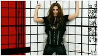
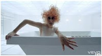
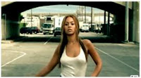
These help to portray the star in whatever way the director feels. In our video, we wanted to show our star as glamorous, stunning and intriguing.
Existing videos...

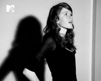
Silhouettes
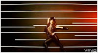
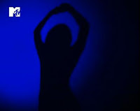
Silhouettes have an intriguing and mysterious air to them. They help to draw the audience in.
Existing videos...
Silhouettes have an intriguing and mysterious air to them. They help to draw the audience in.
Existing videos...
Our video...
Close-ups of lips
This helps the audience to focus specifically on the lyrics. We used this convention to emphasise the “kisses” part of the lyrics.
Existing video...
Floating objects
Floating objects are very effective in music videos. They emphasise the object themselves whilst giving an abstract look to the shot.
Existing videos...
Floating objects are very effective in music videos. They emphasise the object themselves whilst giving an abstract look to the shot.
Existing videos...
Editing –
We used cuts to match the speed of the song. Fast paced cuts are very typical of the music video genre and are very effective in emphasising the beat of the music.
At the beginning of the song, chimes are heard in the music. To emphasise these, we added flashes of light. This is sometimes used in existing music videos also.
We kept the miming and the song in sync. Without this we believe our music video would look tacky. We are proud of how we kept them in sync as Grace isn’t even the true singer of the song!
We added an effect on the following scene to make it look sunnier and more glorious. The decrepit alleyway is acting as a contrast to Grace’s glamour. The extra light emphasises this contrast as it looks as though Grace is bringing light into this dark, dull and gloomy place.

We added an effect on the following scene to make it look sunnier and more glorious. The decrepit alleyway is acting as a contrast to Grace’s glamour. The extra light emphasises this contrast as it looks as though Grace is bringing light into this dark, dull and gloomy place.
