 When looking at the cover, we decided that there needs to be a strong continuity between the two. In the case of the front cover, we have to continue using the desaturated, and colour pop, effect. This image then appears as this -
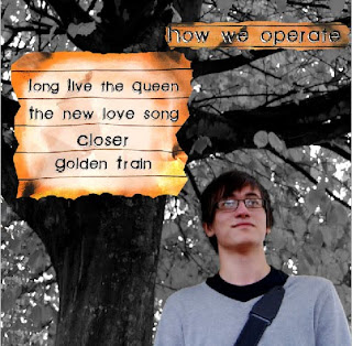
  We then added the text to the image by using the same font used on the cover. We duplicated the layer that reads "How we operate" from the cover of the CD, as well as taking the small piece of burnt out lined paper to use as its background and frame. We then decided to use the lined paper effect to display the names of the songs on too.
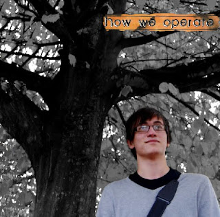
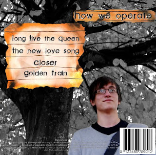
 We then looked at examples of existing CDs to determine what information was left at the bottom of the panel. We found that there was information about the companies involved in the manufacturing and distribution of the CD and the use of a bar code. We then decided to add these features to our own work.
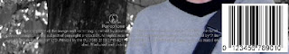
This is the final created product.