Research


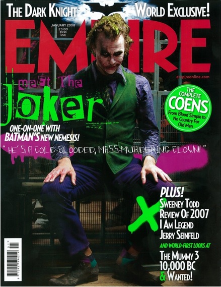
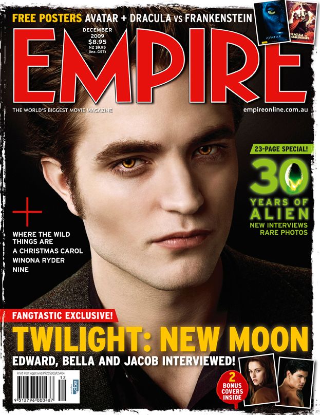
We looked at magzines for inspiration for the mag cover, particularly looking at Empire as afterall we are using the same name and dont want to create a mag that is nothing like what its supposed to be like. We liked the idea of an object in the photo used overlayering the title of the mag and we will try this out. We also noticed that the text is all in capitals using a bold font that is eye catching. Empire use mainly one main focus point for each magazine e.g harry potter then sometimes other smaller images for other films or just text about other films. We think that capital bold text on the mag will be a good idea at catching attention, but not using other images just sticking with the main focus point which will be our film OBSESSION.
Magazine Cover 3rd attempt

Changed the magzine title to a font we wanted, its plain yet bold so it stands out without looking too much therefore it gets peoples attention easily. The title has also been layered behind the tree to give our image a 3D effect using the branch. With the same branch we have added a text effect in order to make it appear like its been carved into, it says 'you cant escape my love'.
Magazine Cover 4th attempt

Changes:
- Title bigger and more submerged behind branch layer for increased 3D effect
- Font changed on title of film and tag line for more bold and readable font after looking at research this was a definite change needed.
- Added 'World Exclusive' to catch attention and make our movie the main focus point of the mag
- Again after research we decided to keep most of the text in capital letters again to capture readers attention.
- Added other movies to the bottom of the mag.