 The Arctic Monkeys' first album has a black and white theme, and a very simple picture of a man smoking. The man looks very ordinary, and down to earth, the style we are looking for in our project. The name of the band being on a sticker is an alternative style rather than printing the name on the cover.
This Babyshambles album cover uses black and white colour scheme, similar to a theme we wish to use throughout the project for continuity and we like the contrast between a simple painting, and a photograph. This is because at shows the contrast between the old and the new. The album cover incorporates the idea of voyeuristic protrayal of females in music, as the photograph shows Kate Moss in here underwear. The font used on the cover appears as though distressed, but once classy. This has elements of the font we wish to use, although we intend to use a font that isn't distressed and is slightly more elegant.
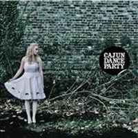 This cover is very similar to what we want to achieve with our album cover. We like the simple backdrop and the low contrasting colouring which is used. The girl stands out from the background as she is wearing pale colours, which connatate innocence, and a dress which seperate her from the background and raises questions to the potential customer.